Transit in Yellowstone National Park
Trillium recently completed timetable and map designs for the “Linx Bus in Yellowstone,” a network of services that will operate in Yellowstone National Park for the second time this summer season. The service is coordinated by the Linx Transportation Cooperative, a project of the Yellowstone Business Partnership.
Let our team know what you think of the timetables and maps, below.
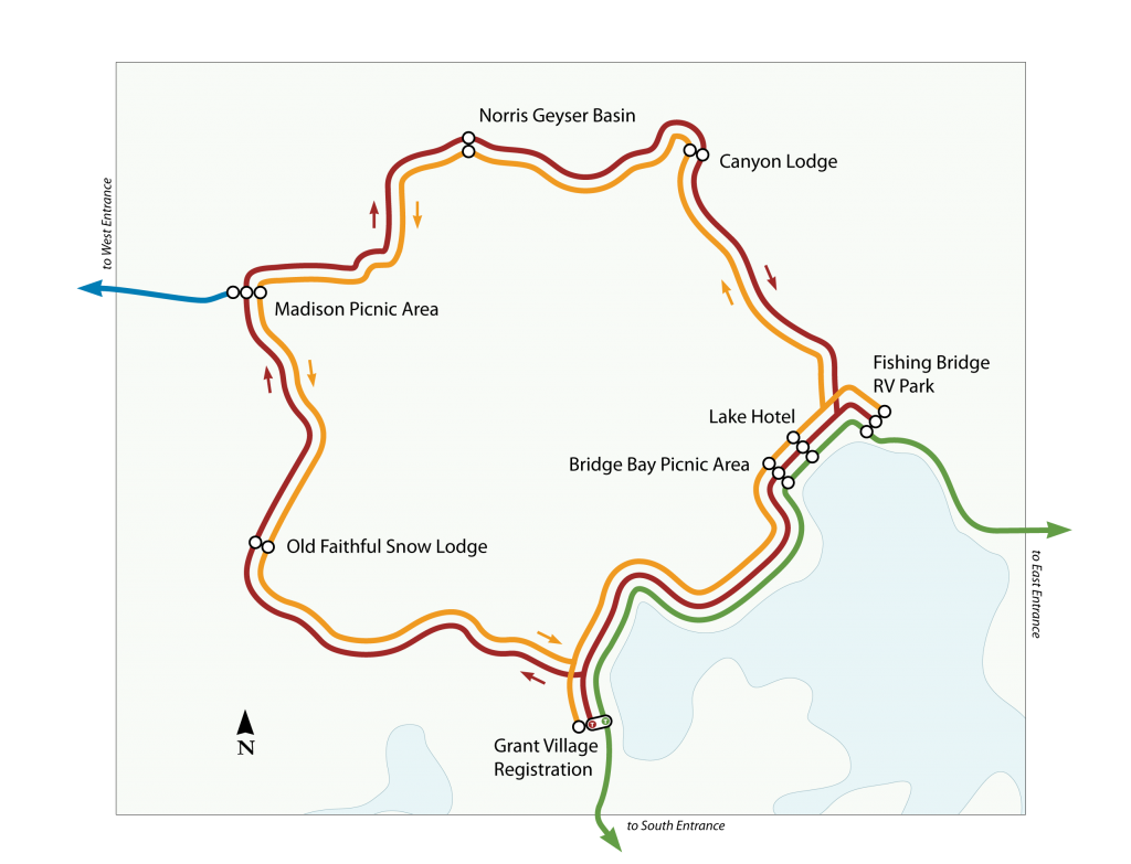
I think I would have swapped the Red and the Orange lines on the map so that they would appear to be going in the directions that one would drive on a two-way road — i.e., clockwise on the outside and counter-clockwise on the inside.
Good spot. Originally, the designer, Jacob Peel, created the map that way. We wanted to match the sides of the road for driving. But then we needed to put the Red and Green Lines nearby each other to show the timed transfer. That ended up being higher priority.
It was a trade-off. Do you agree with this? Could you think of a different way to do it?
A couple of thoughts…
1) Red and green together are bad for colour-blind people. Maybe use purple instead of red
2) The map doesn’t highlight that blue has a timed transfer to red and orange. The fact one is highlighted for red/green implies the other transfer points aren’t timed.
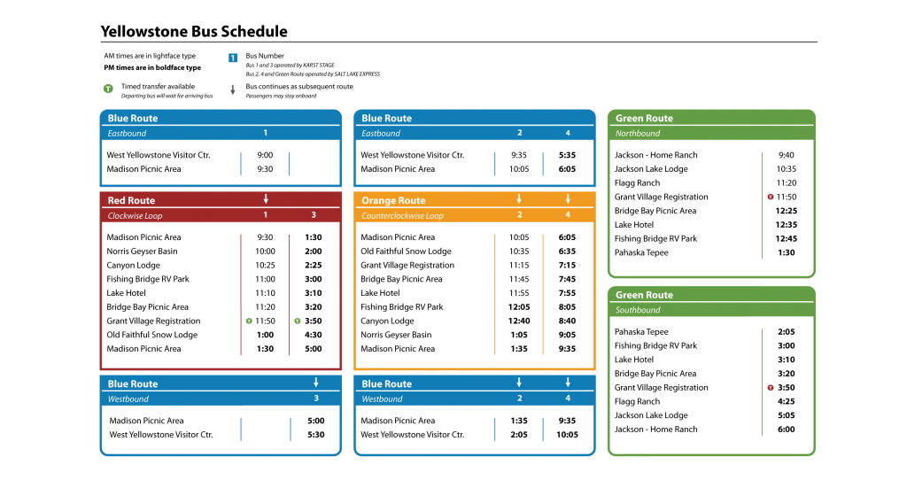
While I like how the timetable works with just two vehicles (cunning!), the number of trips per day on each route seems very low.
Hopefully 2012 will bring a successful season of transit in Yellowstone, and it will become possible to increase the level of service in the future!
1.) I understand the issue regarding red and green. We discussed this, and may revisit the issue. The limitation here is that it would be nice to have continuity with the service names from last year.
2.) We spent a lot of time thinking about transfer points in the system. We have indicated the in-seat transfers in the timetable at Madison Picnic Area, which, for the purposes of the passenger are even better than timed transfers. But the only “timed transfers” in the system, in the sense of one vehicle holding for another, are at Grant Village between the Red and Green routes.
Our concern was that it was important to have consistency in the meaning of symbols in the map. We also did not want to introduce too many different symbols.
If we were to introduce a way of indicating in-seat transfers at Madison, what do you think would be best? Should we copy the approach we used at Grant Village (colored “T”)? Introduce another symbol that means “in-seat transfer available”?